
Part of my moving to python for science.
I have lately been using gnuplot to monitor the progress and end results of my simulations. These are 2D hydrodynamic simulations, which involve 2D scalar and vector fields.
2D plots
With gnuplot, I used to run stuff like
plot ‘8000/points.dat’ u 1:2
for a 2D plot of a scalar field. On column 1 I have the x values of the coordinates and on column 2 the y values, so this just plots the coordinates. The “8000” is the directory for time step 8000, where the data file is saved.
OK, now running ipython –pylab I have to run
dt = pylab.loadtxt(‘8000/points.dat’)
ss=scatter(dt[:,0],dt[:,1],c=dt[:,11],s=50)
2D scatter plot with colors
Important things to notice:
- python starts numbering c-style: at 0! so, despite pylab having been designed in order to mimic matlab syntax, there is a clear departure here.
- it’s easy to assign a color to the points, in this case column 12 (11 for python) is a density field. The default color scale looks ok (it goes from blue to red).
- the size is set to 50 for a nice full-screen view.
- New plots will appear on top of this one. If this is not desired, close the window, or run pylab.clf()
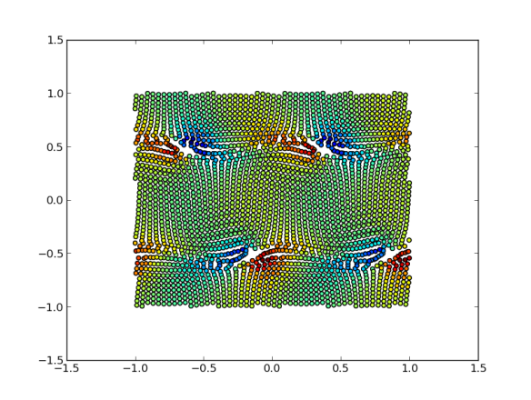
Vector plots
This is quite easy in gnuplot:
plot ‘8000/points.dat’ u 1:2:($5/10):($6/10) w vec
On columns 5 and 6 I store the x and y components of the velocity. In this example they are reduced ten-fold in order to hace a decent plot (and this has to set by hand…).
Now we may run:
st=quiver(dt[:,0],dt[:,1],dt[:,4],dt[:,5],dt[11])
which does the same. A bonus is that the vector length is automatically calculated from the average vector length. This may the right solution, if not the option “scale=xx” may be used. The higher xx is, the shorter the arrows (??). The fifth entry is a color code, which does not look to good at present because, I think, they are taken as RGB values, unlike with scatter.

Vector plot — funny senseless colors
3D plots
This one’s harder. To get a scatter 3D plot of three columns I used to run
splot ‘8000/points.dat’ u 1:2:12
Now, it’s more like
from mpl_toolkits.mplot3d import Axes3D
fig = plt.figure()
ax = fig.add_subplot(111, projection=’3d’)
ax.scatter(dt[:,0],dt[:,1],dt[:,11])
fig.show()
That produces a quite nice scatter plot with tick marks on the three axes.

3D scatter plot
